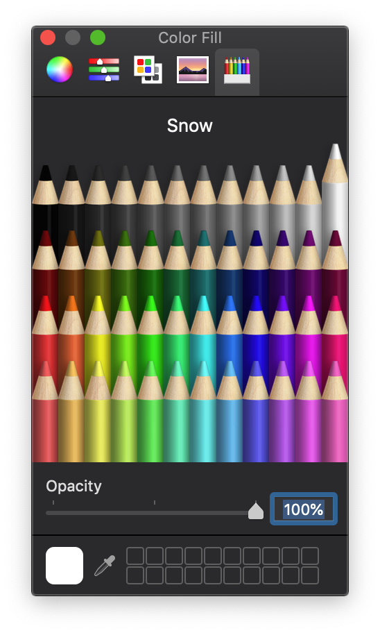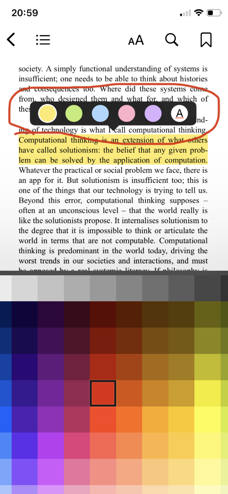
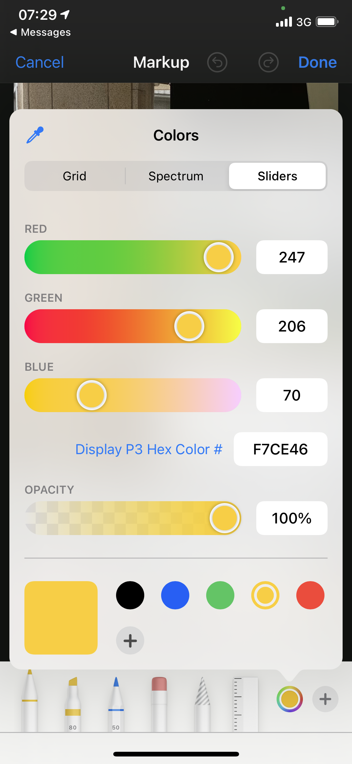
For years I only interacted with color in a 2-dimensional context. By choosing a color swatch for a wall, picking a background color in a presentation, or highlighting text in a book. Then in college, many of my design tools started to have a new color picker with much more complexity. We are going to call this new interface the color cube.
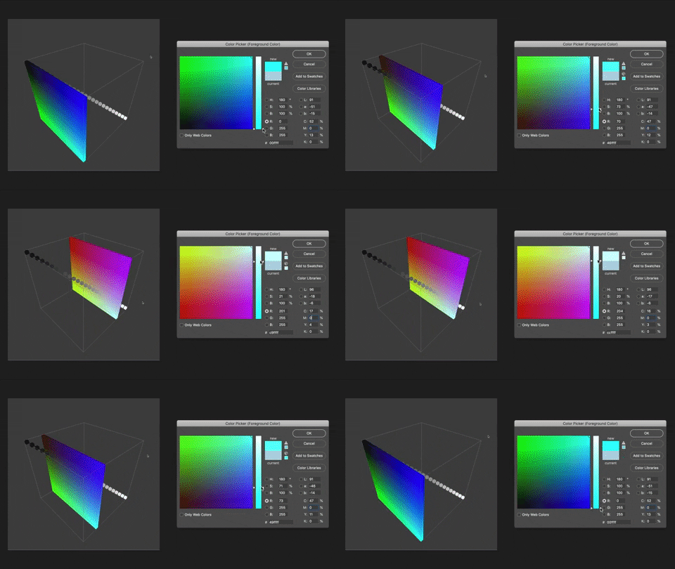
Moving along the R(ed) along the X-axis ⤴
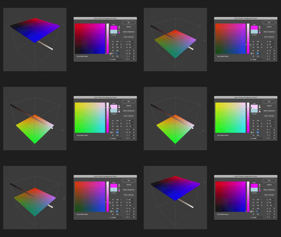
Moving along the G(reen) along the Y-axis ⤴
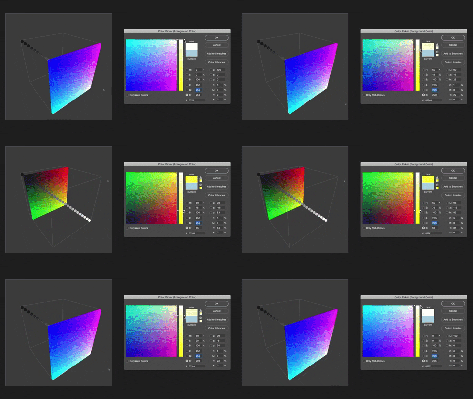
Moving along the B(lue) along the Z-axis ⤴
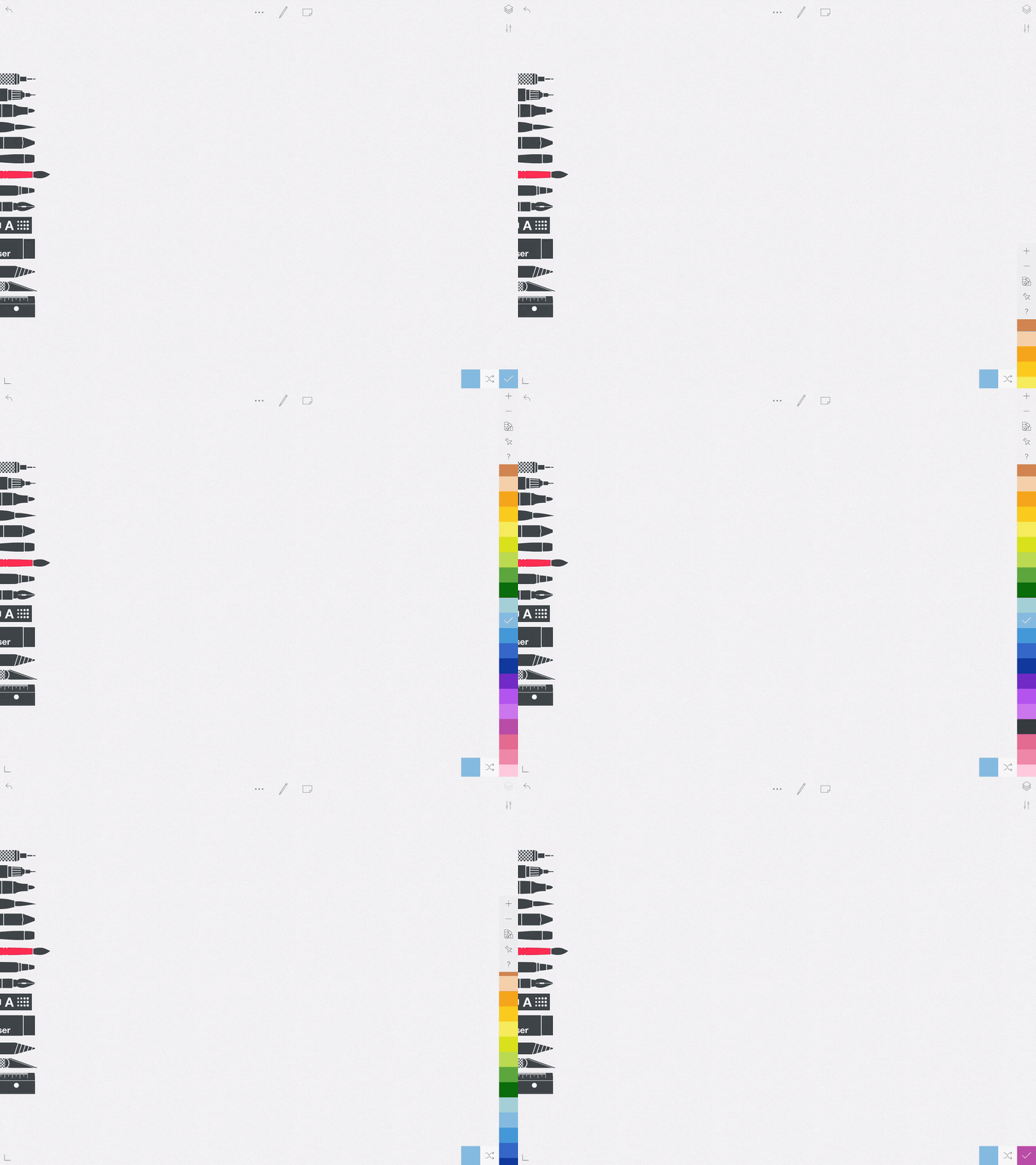
At first glance, the color cube feels just like other 2D interfaces but the power comes when you realize that this interface is an attempt to communicate color in 3D.
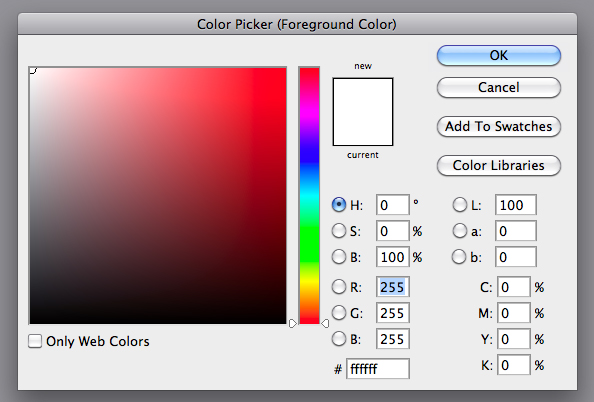
Each primary color is given an axis R(ed), G(reen), and B(lue). Where R is the X-axis, G is the Y-axis, and B is the Z-axis as shown below.
This enables you to think of color as a space which shows the relationship between colors more accurately while letting you see the more direct effects of changing the hue or saturation.
Although this color cube interface has become pretty standard in design tooling there are a few other interfaces which abstract the color space which I wanted to call out.
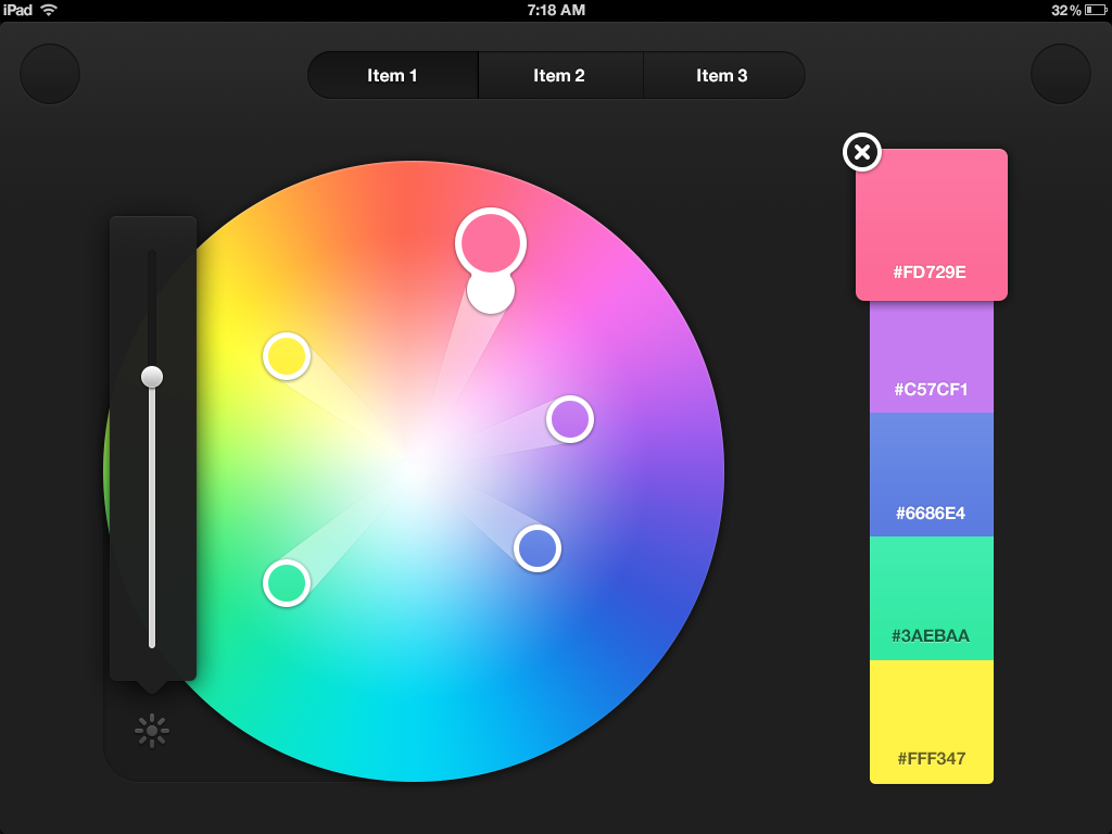
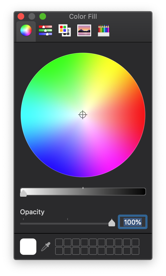
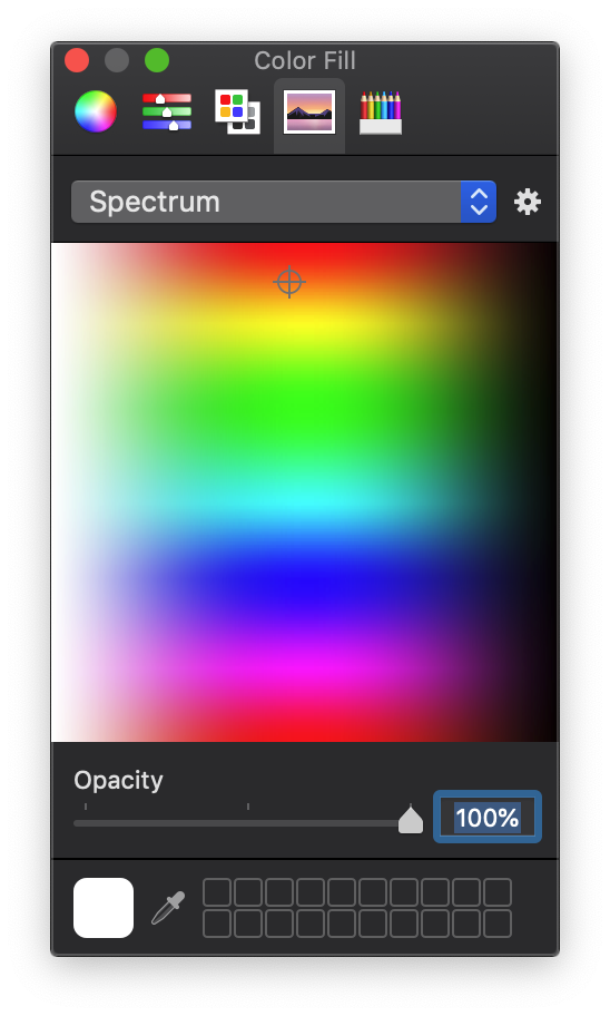
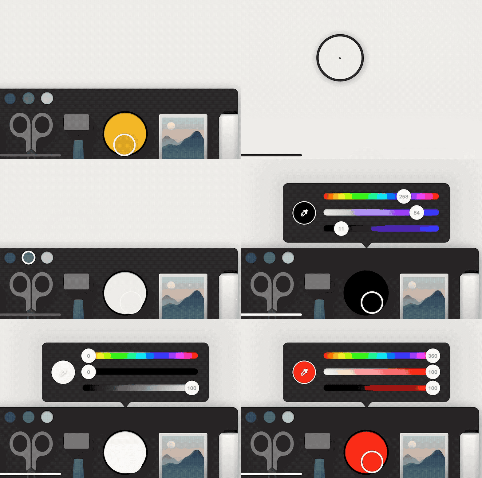
Radial or Spectrum Pickers display most available colors and arrange them by saturation where the center fo the circle it the most saturated and the outside is the least.
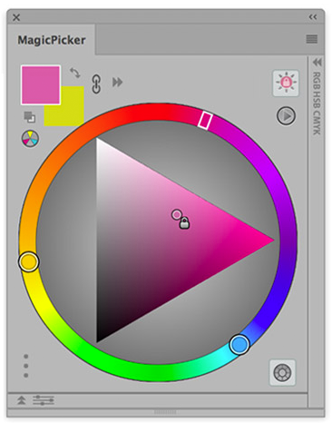
Mixed or Blending Picker allow for a base palette to be mixed with a new color similar to how you might mix paint.

And that it for now, I have collected all the example in and are.na collection and would love to have anyone add to it!
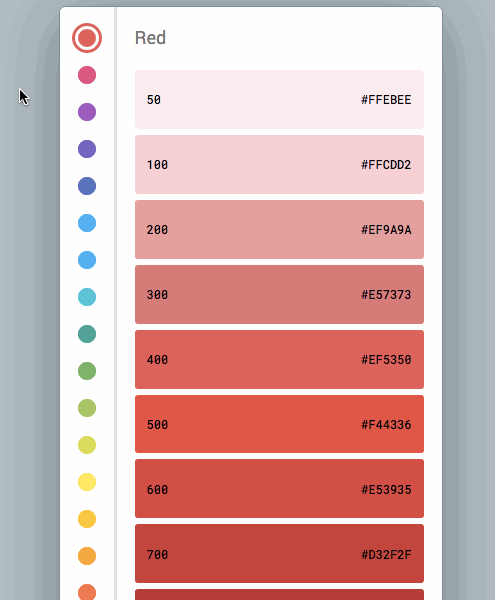
Color Swatches tend to sort a color by hue and limits the number of hugs available.
