HALLO ALL!
I'm sure this is a bit weird if you're reading there - or on the RSS feed - because it's one huge image.
But this is an issue with RSS - it's difficult to know how your nicely designed post will look in any given browser

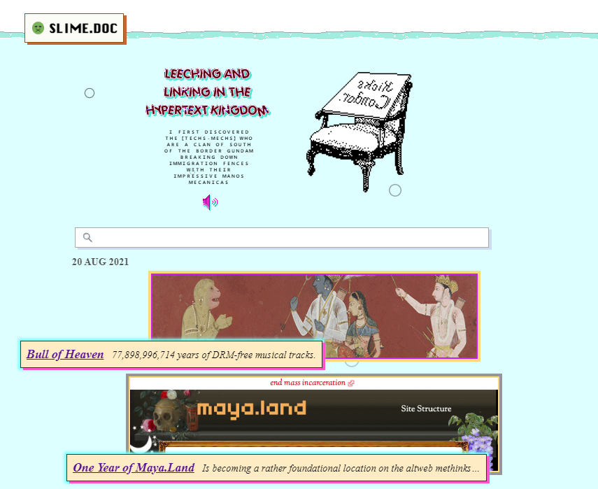
If you are reading this from Multiverse, well - here's a pic of my blog - I like it! It's my special PLAYTHING!
This is a post I wrote on Multiverse and crossposted to my blog
But there is also a link above to the original hypertext if you need it
For a few months I wondered: "Will I switch my blog to Multiverse once it's done?"
But now I see
No need!

Multiverse posts - based on Weiwei's 'comic logs' - are utter maximalism! They can be dense with glitter and rabbit stickers.


And it's not that I don't want my blog to be this way - I find it to be quicker and more expressive to dump thoughts and styles into posts like this one
But I think I like the idea of moving between formats - sometimes pasting together a comic
And other times keeping it to a minimal bit of hypertext
Doing this sacrifices the 'network effect' of Multiverse
Imagine future tools even beyond this
Perhaps styled posts could one day become more widespread
Using the tool when it makes sense
Rather than needing to jump ship from your existing blog or wiki or social site
But whatever - the thing that's really enticing to me is offering a tool for blogging that augments what you're already doing
But that is a short-term vision
The Web is the long-term vision
If we can strengthen it and make it more varied and full
Perhaps it will live on!
Perhaps one day styled posts could be embedded nicely in feeds - no one cares yet
if it is fluid to cross networks, then you can drop off a network quite easily